What Makes Perry Rhodan Arkon System Art So Iconic?
What Makes Perry Rhodan Arkon System Art So Iconic?
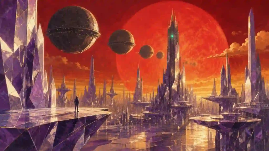
You search for one crystal planet picture and land in a mess of reposted thumbnails with no artist, no issue number, no context. Nobody tells you which painter made it, which novel it belongs to, or why the sky is that shade of violet. That gap is frustrating for collectors and painful for artists. This guide fixes it, piece by piece.
What Is Perry Rhodan Arkon System Art?
Perry rhodan arkon system art is the body of illustration built around Arkon, the three-planet home system of the Arkonide race in the long-running German science fiction series Perry Rhodan. It covers painted paperback covers, interior line work, poster editions, digital matte paintings and fan galleries.
The subject matter is narrow but deep. Three artificial-feeling worlds, a red giant sun, a crystal palace, and a machine that rules an empire. Almost every image you find returns to those four anchors.
Two things separate this niche from generic space art. First, the visual rules were set in print between 1961 and today, so there is a real canon. Second, the artists are named and credited, which means you can trace an image to a person and a publication date.
Why Arkon Became the Visual Heart of the Series
Terra is the emotional home of the series. Arkon is the spectacle. Writers used it as the decadent, ancient counterweight to a young Earth, and illustrators followed that brief with heavier ornament, colder light and taller architecture.
Readers remember Arkon because it looks unlike the rest of the galaxy in the books. That memory is why perry rhodan arkon system art keeps circulating decades after the original novels sold out.
- Contrast: organic Earth versus engineered Arkon
- Scale: planets treated as single structures, not landscapes
- Decay: an empire coasting on inherited technology
- Control: a central machine intelligence watching everything
The Three Worlds and How Artists Paint Them
Arkon holds three planets, and each one has developed its own visual shorthand across sixty years of covers. Knowing the difference lets you identify an image in seconds.
| World | Role in the Story | Dominant Visual Cues | Common Colour Palette | Typical Composition |
|---|---|---|---|---|
| Arkon I | Seat of power, the Crystal Palace | Faceted spires, mirrored plazas, refracted light | Ice white, violet, pale gold | Low angle, spire dominating frame |
| Arkon II | Commercial and industrial world | Docks, freight rings, dense skylines | Rust orange, steel grey, smog brown | Wide horizontal cityscape |
| Arkon III | Military and shipyard world | Battle fleets, ring docks, weapon platforms | Gunmetal, blood red, black | Deep space with fleet in formation |
| Arkon Sun | Red giant anchoring the system | Bloated disc, long shadows | Crimson, amber | Backlight silhouette |
| Robot Regent | Machine ruler of the Imperium | Monolithic tower, lens arrays, cable trunks | Green signal light on dark metal | Vertical, oppressive, human figure tiny |
That table alone answers the question most people actually type into search: how do I tell one Arkon planet from another in a picture?
Who Painted the Classic Covers?
Johnny Bruck defined the early look. He produced the overwhelming majority of the series’ first-run covers from 1961 into the mid-1990s, working fast in gouache and oils with bold silhouettes and saturated skies. His Arkon images are the template every later artist argues with.
After Bruck, the series moved through several strong hands. Swen Papenbrock, Alfred Kelsner, Dirk Schulz and Arndt Drechsler each brought sharper anatomy, digital lighting and a cooler, more cinematic palette. Their versions of the Crystal World feel architectural rather than painterly.
Naming the artist matters. When you credit the painter and the issue number, your perry rhodan arkon system art post becomes a source instead of a repost.
Colour Language: Reading an Arkon Image
Colour does the storytelling work here. Once you learn the code, you can guess a scene’s mood before you read a single caption.
- Violet and white: court intrigue, the Crystal Palace, aristocratic Arkonides
- Deep red: the giant sun, imperial decline, war
- Green point-light: machine intelligence, surveillance, the Regent
- Cold blue rim-light: Terran ships intruding into Arkonide space
- Black voids with hard edges: fleet actions and shipyard scenes
Artists rarely mix all five. Two dominant hues plus one accent is the working rule across most published covers.
Architecture and Design Motifs You Will Keep Seeing
Arkonide design leans on symmetry, crystal geometry and enormous vertical scale. Buildings read as grown rather than built, with facets catching light at improbable angles.
Look for these repeating motifs when you study or draw the system:
- Hexagonal and dodecahedral facets
- Floating platforms with no visible supports
- Domes over entire city districts
- Corridors lit from the floor rather than overhead
- Ships shaped as spheres and discs, not wedges
- Ornamental scripts etched into structural surfaces
The sphere is the signature. Arkonide capital ships are round, and that single choice separates a genuine Arkon composition from generic space opera.
Ships, Fleets and the Spherical Silhouette
Arkonide warships appear as vast spheres, and painters use them to create depth. A single sphere in the foreground, three in the middle distance, a smear of dots near the horizon, and the scale reads instantly.
Fleet scenes also solve a lighting problem. A red giant behind the fleet throws long shadows and rim-lights every hull, which is why so many Arkon III paintings use backlight.
The Robot Regent as a Visual Subject
The Regent is the hardest element to draw well. It is a positronic ruler, not a character, so artists must give a machine presence without a face.
Successful versions share three traits:
- A human or Arkonide figure placed small in frame for scale
- Cold, single-source light from the machine itself
- Cables, conduits or data columns leading out of frame
Those three moves turn a box of metal into a ruler. They are the reason Regent images remain the most reproduced pieces of perry rhodan arkon system art on fan boards.
Where to Find Authentic Artwork Legally
Start with the publisher. Pabel-Moewig, the rights holder, runs the official series site with cover galleries, artist credits and shop editions. Reference material from the source is always safer than a scraped image.
Perrypedia, the community-built encyclopedia, indexes covers by issue number and names the illustrator for each. It is the fastest way to attach a citation to an image you already have.
For English-language readers, the licensed international editions carry their own commissioned covers, which are worth studying as a separate visual tradition.
- Official series site: perry-rhodan.net
- Community encyclopedia with artist credits: perrypedia.de
- English-language editions and cover archive: perry-rhodan.us
Those three are the primary sources. Everything else is commentary.
Copyright, Fan Art and What You Can Publish
Published covers are copyrighted. Reproducing a full cover on a commercial page without permission is a real risk, not a theoretical one.
Practical guidance that keeps you clear:
- Original fan art: yours, but keep it non-commercial unless licensed
- Published covers: credit the artist, link the publisher, use small format for commentary
- Merchandise: requires a licence from the rights holder
- AI-generated imitations: avoid passing them off as series art; the community notices
Ethical sourcing also protects your ranking. Google’s guidance rewards pages that show real sourcing and clear attribution, and it demotes thin galleries that add nothing.
How to Create Your Own Arkon-Style Illustration
You do not need the licence to work in the style. You need the rules.
A workable process:
- Pick one world. Crystal palace, industrial docks, or shipyard. Do not mix them.
- Set the sun first. The red giant decides every shadow in the frame.
- Choose two hues plus one accent. Follow the colour language above.
- Place a human-scale figure. Without it, the architecture has no size.
- Use spheres, not wedges, for any Arkonide hardware.
- Under-detail the background. Faceted haze beats fussy linework at distance.
- Finish with one impossible element — a floating plaza, a mirrored sky.
Beginners overload step six. Restraint is what makes strong perry rhodan arkon system art read clearly at thumbnail size, which is exactly how most people will see it.
Digital Versus Traditional Media
Bruck-era work was physical paint, and it shows in the edges. Brush texture, warm colour drift, slightly loose anatomy, and a poster-like flatness that scans beautifully.
Modern contributors work digitally, with layered lighting, 3D blockouts for architecture and photobashed textures. The result is sharper and more consistent, though some collectors miss the hand-made warmth.
Neither approach is better. If you are building a portfolio, a mixed set that shows both hints at range and earns more attention from art directors.
Collecting: Prints, Editions and Condition
Collectors chase original paintings, signed prints and complete run sets. Prices swing hard on artist name and condition.
Points worth checking before you buy:
- Issue number and printing, since reprints use different covers
- Whether the signature is printed or hand-applied
- Paper yellowing and spine wear on 1960s and 1970s issues
- Provenance documentation for any claimed original painting
- Print size and whether it is an authorised edition
Ask the seller for the artist’s name. A seller who cannot supply it is guessing, and guessing is expensive.
Related Entities Worth Knowing
Understanding the surrounding entities makes your reading and your searching far more precise.
- Arkonides: the ruling humanoid species of the system
- Great Imperium: the empire administered from Arkon
- Atlan: the best-known Arkonide character, an Imperium admiral
- Perry Rhodan: the Terran protagonist whose arrival destabilises Arkon
- Thora and Crest: the Arkonides who first meet Rhodan on Luna
- Pabel-Moewig Verlag: the publisher and rights holder
- Johnny Bruck: the defining cover illustrator of the classic era
- Perrypedia: the community reference for issues and credits
Each of those names unlocks a different slice of imagery, and together they explain why perry rhodan arkon system art has such a consistent visual identity.
Common Mistakes People Make With Arkon Imagery
- Painting Arkonide ships as wedges or arrowheads
- Lighting the scene with a yellow, Sol-like star
- Giving the Crystal World a green, Earth-like sky
- Cluttering a composition that needs emptiness
- Posting artwork with no artist credit
- Confusing Arkon II industry with Arkon III shipyards
Fixing the first three alone will make your work look canon-aware to anyone who has read the novels.
A Simple Study Plan for Newcomers
Spend one week on each stage and you will read this art fluently.
- Study twenty classic covers and note the sun position in each
- Sketch the three worlds from the table above, one page each
- Copy one Bruck composition in greyscale to learn his value structure
- Rebuild the same scene in your own palette
- Post it with full credit to your reference and the artist
That sequence trains the eye faster than reading theory, and it produces a portfolio piece at the end.
Frequently Asked Questions
What is the Arkon system in Perry Rhodan?
It is the three-planet home system of the Arkonide people, ruled for long stretches by a positronic machine known as the Robot Regent, and the seat of the Great Imperium.
Who is the most famous Perry Rhodan cover artist?
Johnny Bruck. He painted the vast majority of the series’ first-run covers from 1961 into the 1990s and set the visual template later artists still respond to.
What colours define Perry Rhodan Arkon system art?
Violet and crystal white for the palace world, rust and steel for the industrial world, gunmetal and red for the military world, all lit by a red giant sun.
Can I sell fan art of the Arkon system?
Not without permission. Original personal work is generally tolerated when non-commercial, but selling prints or merchandise needs a licence from the rights holder.
Where can I see official Arkon artwork?
The official publisher site and Perrypedia both host cover galleries with artist credits and issue numbers, which makes attribution straightforward.
Why are Arkonide ships spherical?
The series established spherical hulls as Arkonide engineering practice early on, and that silhouette became the fastest visual signal that a scene belongs to Arkon.
Start Your Own Arkon Piece This Week
Pick one world. Set the red sun. Add a figure for scale. That is a complete study, and you can finish it in an evening.
Then do the part most people skip: credit your references, name the artists who taught you, and link the publisher. Doing that turns a gallery post into a resource, and resources are what readers bookmark, share and come back to.
If you publish a piece of perry rhodan arkon system art this month, tag your sources and share the process. The community grows on attribution, and your work deserves to be found by name.